SKETCH
Stick It, Sketch It!
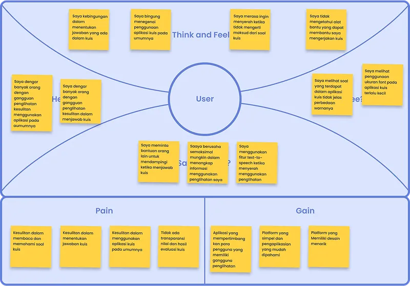
After gaining a basic understanding of visual impairment, we proceed to
generate every idea that comes to our mind and write it down on
post-its.
Categorize users as teachers or students
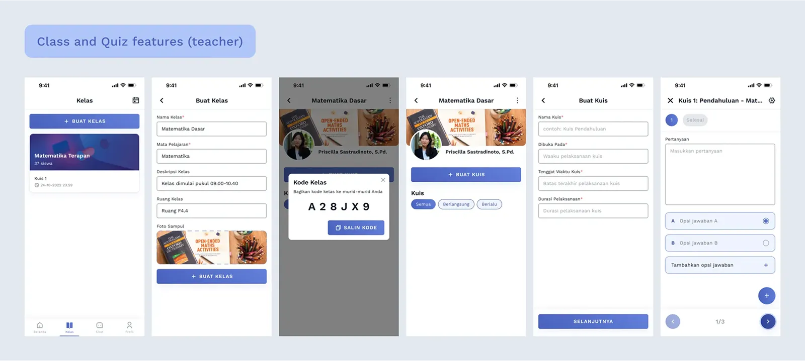
Add a feature for teachers to create classes
Add a feature for teachers to create quizzes
Add a feature for students to join classes
Add a feature for students to take quizzes
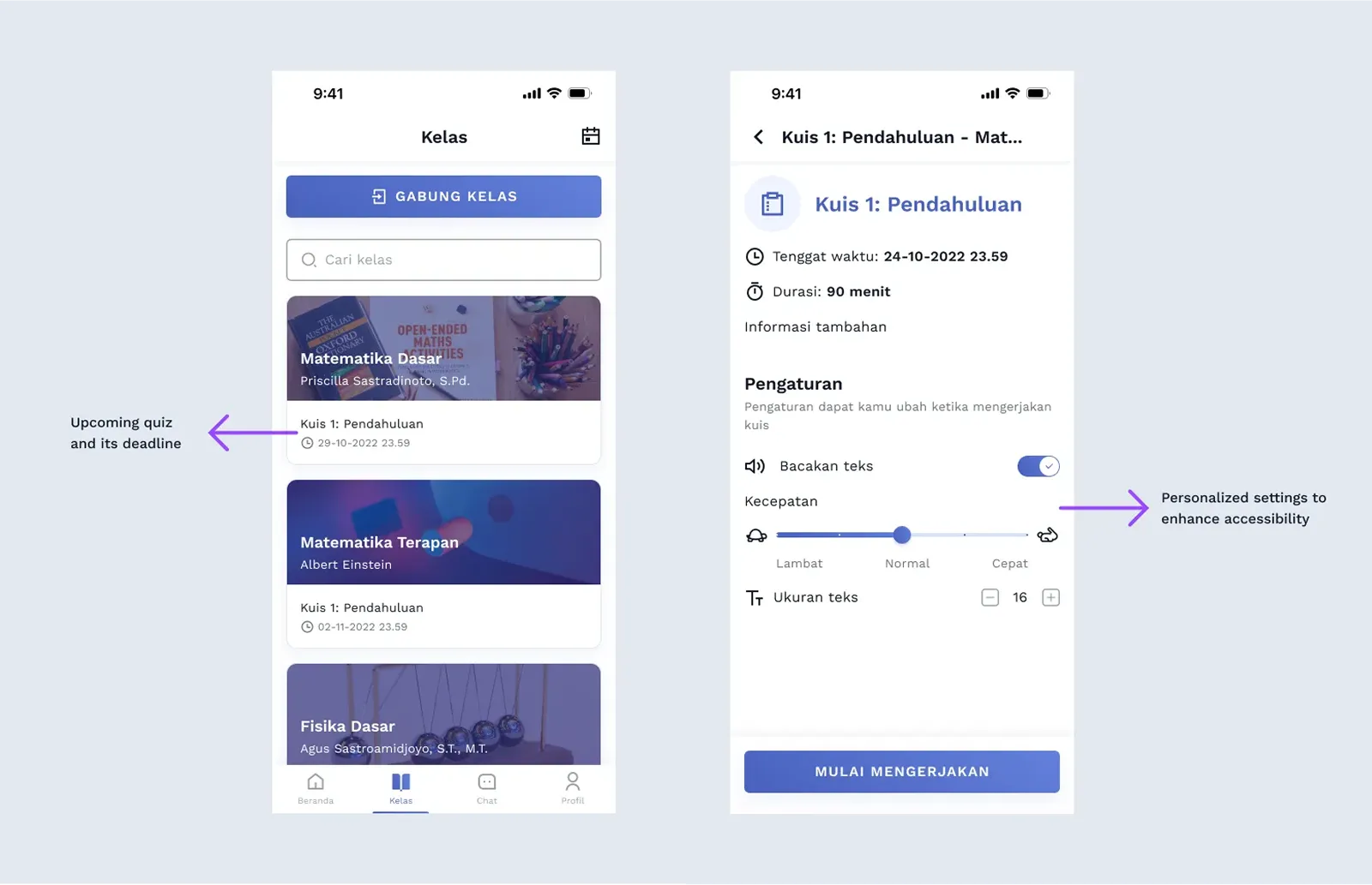
Customize the user interface for users with visual impairments
Adjust font size when taking quizzes
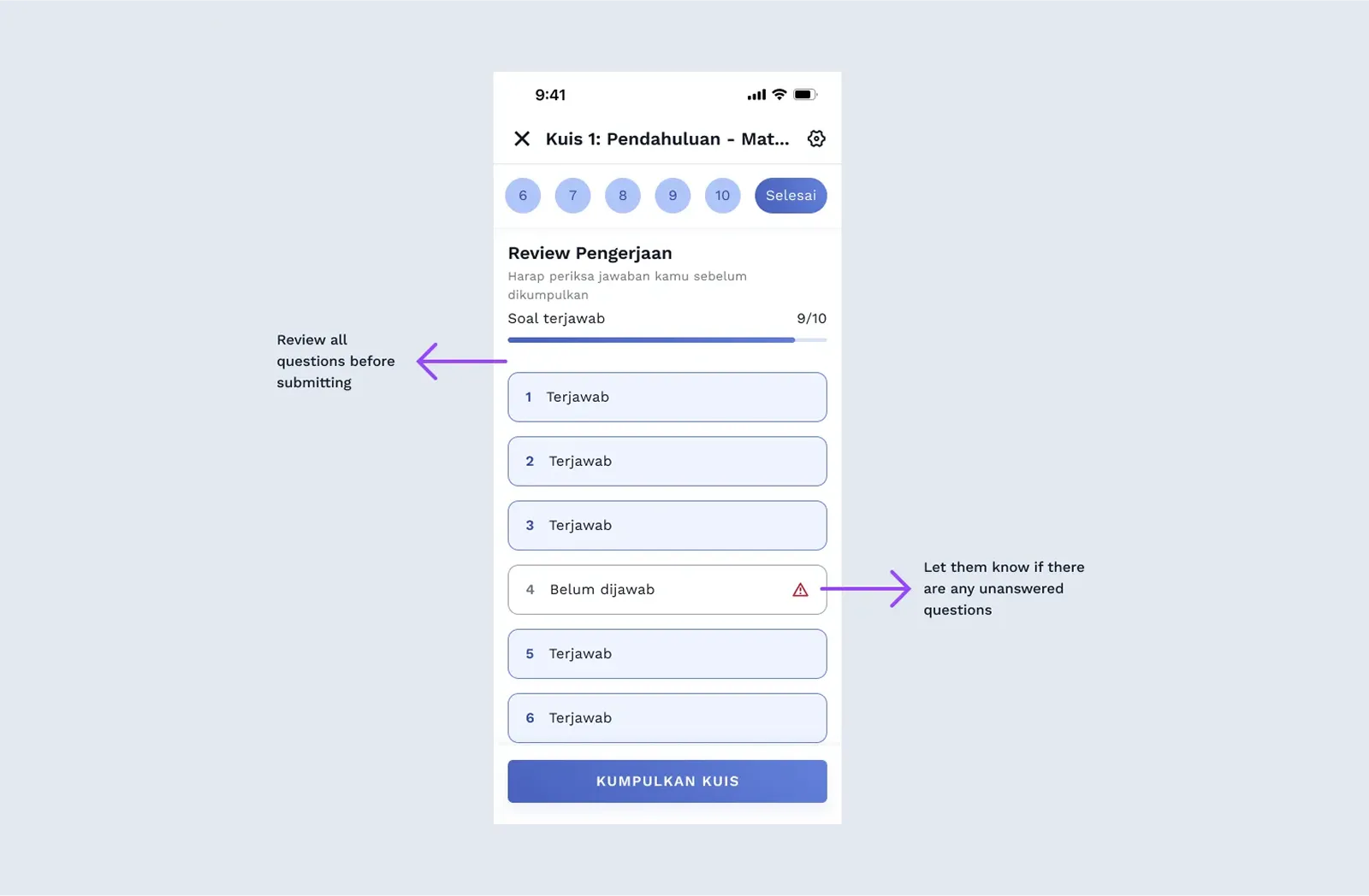
Provide quiz evaluation to enhance the learning process
Include a group messaging feature to facilitate classroom
communication
Track learning outcomes as part of the evaluation process
Add a text-to-speech feature to support accessibility for visually
impaired users
Allow users to adjust text-to-speech speed according to their
preferences
Solution Ideas
Next, each of us sketched ideas using the Crazy 8’s method to depict the
solution ideas. There are 4 crazy 8 we made, here below is only my crazy
8.
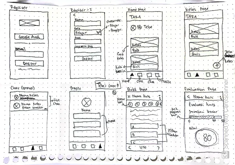
Crazy 8's (Tebe)
DECIDE
The Vote That Shapes the Vision
After sketching, my teammates and I presented our solution to discuss
which features would be better for our users. We then engaged in a
constructive critique of each other's solutions, carefully considering
the strengths and weaknesses of each solution. Finally, we voted to
decide on the best solutions that would address the needs of our users
most effectively.
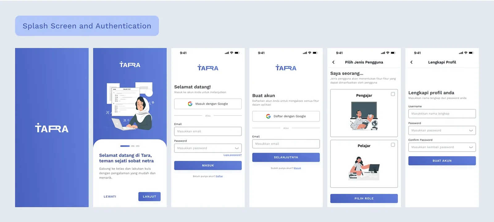
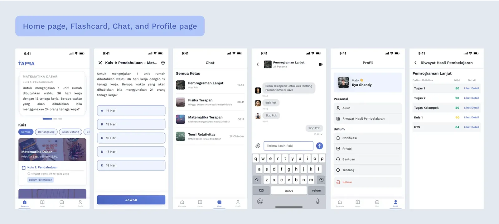
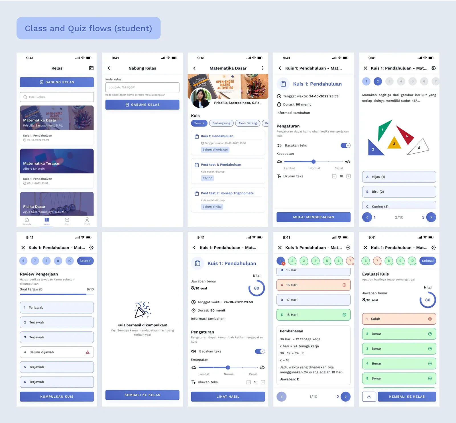
PROTOTYPE
From Sketch to Screen
We turned our ideas into an interactive design focused on usability and
accessibility. This allowed us to test key features, simulate the user
experience, and gather feedback for improvements.
From Screen to Hand
In this phase, we transformed our chosen ideas into an interactive
prototype that users could experience firsthand. The prototype focused
on key features to address accessibility for visually impaired students,
ensuring inclusivity and ease of use. This step allowed us to bring our
concept closer to reality and prepare for user validation in the next
stage.
Or experience it with your own hand
VALIDATE
Accessibility Check: Yay or Nay?
We conducted a moderated usability test to identify any usability and
accessibility issues with our design. We invited 3 participants that we
interviewed before and we observed them while they performed the tasks
we specified, asked them to think aloud and also asked them questions
related to their experience while testing. The color blind users didn’t
find any issues after conducting the test. However, low vision user
tends to prefer the magnifier tool feature over the adjustable font size
feature.
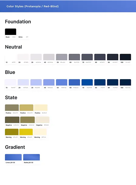
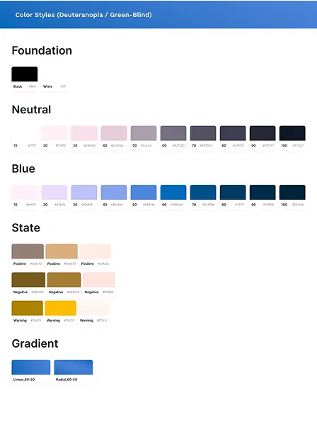
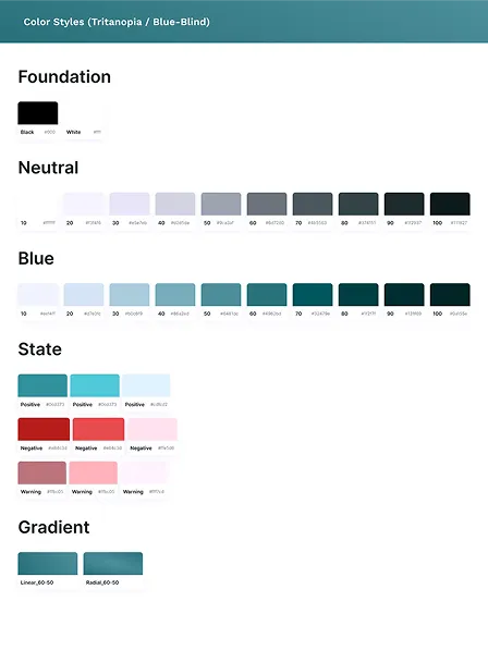
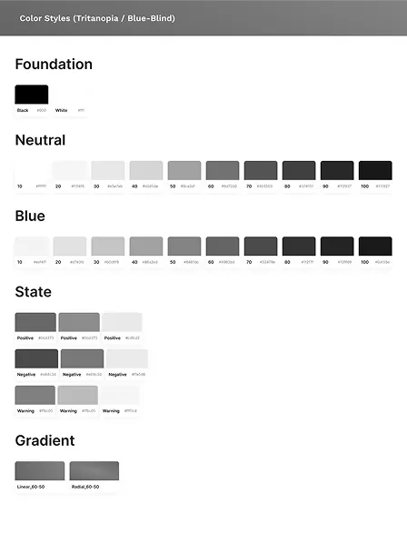
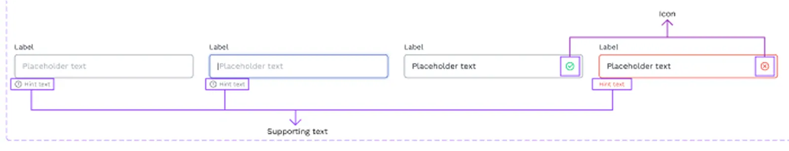
This test also helps us validate various accessibility factors, such as
color contrast, font size, and the different states of the components we
use. It allows us to ensure that the design is accessible for users with
visual impairments, such as those with color blindness, low vision, or
any other visual impairments.
😃
This app is easy to learn. It’s just like any other quiz platform
🤔
I think it would be good if there is a feature to zoom in on certain
text
Key Takeaways
Lesson learned
This project helped me to learn a lot about accessibility design and
the importance of considering it during the creation of a product, not
only physical products but digital products as well. Accessibility
design plays a crucial role in ensuring that products and environments
are inclusive and accessible for everyone, regardless of their
abilities.
What I'd do differently?
Expand the user testing
Involving a wider range of visually impaired users like those with
total blindness and different types of low vision. This would give
deeper insights into accessibility challenges and help refine
features like voice assistance, contrast modes, and navigation
patterns.
Collaborate with accessibility experts
Collaborating with accessibility experts earlier in the process to
ensure the design meets real-world accessibility standards,
reducing the need for major changes later.
A BIT OF MEME FOR YOU :D
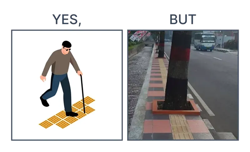
Braille/tactile pavement in Indonesia
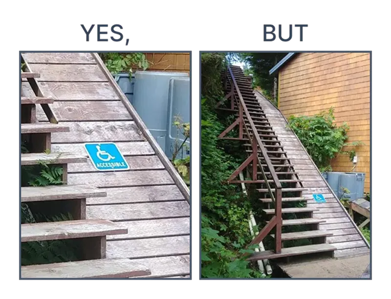
Wheelchair ramp fail