TEAM
ROLE
Users were completing the Refinancing Leads Form smoothly, until one
field slowed everything down:
By reviewing session recordings in Smartlook, I uncovered repeated hesitation during location search. A focused redesign led to a 70.8% improvement in search efficiency.
While reviewing recordings in
Users moved smoothly throught the refinancing leads form, typed their name, filled in their phone number… then they reached Lokasi Pengajuan/Application Branch. And that’s where the rhythm broke.
the video is sped up by 3x
Some kept scrolling through a long list. Others typed their city and got flooded with options. Same district names, different cities. You could almost feel the hesitation.
Most users interacted with the location field in one of two ways:
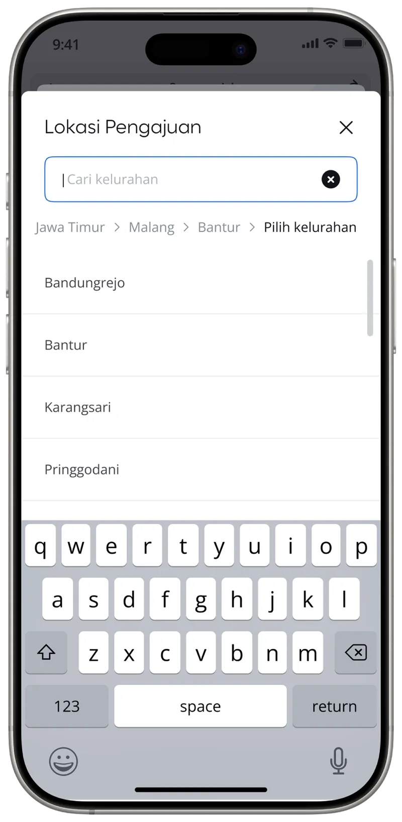
Some district or subdistrict names appeared in multiple cities, forcing users to double-check before selecting.
The task required more attention than it should.
The dropdown combined three administrative levels into one searchable list: City, District, Subdistrict.

Users could type anything, but the system didn’t guide them through the hierarchy.
Search results were broad, repetitive, and ‘noisy’. The lack of structure made simple choices feel uncertain.
If users narrow their location step by step, starting from province down to subdistrict, the search space shrinks at each stage.
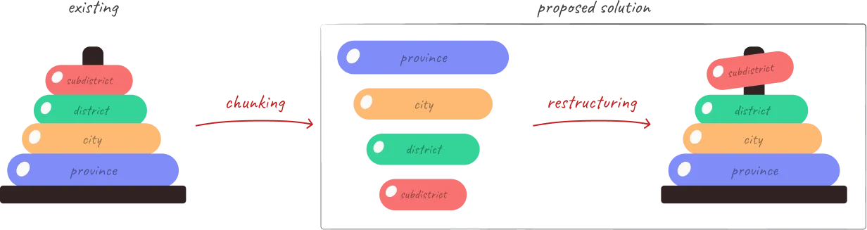
By limiting options progressively instead of exposing everything at once, selection should become faster and more confident.
I replaced the single dropdown with a progressive stepper:
Province → City → District → Subdistrict
But, Tebe, isn’t this adding more steps?
Yes, my manager also asked the same thing.
The stepper increases the number of interactions. But, here are the reasons why it doesn’t matter:
The previous design asked users to search across three location levels at once. That reduced steps, but increased uncertainty.
The new approach adds structure, not friction. Each step narrows the scope, so users make smaller, clearer decisions instead of scanning a crowded list.
Location search time decreased significantly after introducing the progressive stepper.
the video is sped up by 3x
These metrics show improvement across both typical and extreme cases.
Users spent less time scrolling, repeated attempts dropped, and selections became quicker.
A structural change in one field restored the rhythm of the entire form.