LOAN CALCULATOR 100%
CREDIT QUALIFICATION
13.7%
86.3%
INSTANT APPROVAL
TEAM
ROLE
Ever browsed for something, took a few steps in the process, then got distracted only to forget where you left off?
It happens all the time... you explore options, maybe tweak some settings, and then life gets in the way. When you come back, you’re stuck retracing your steps, trying to remember what you did last. The same problem also occurs in the car financing journey.
Many users explore financing options by viewing cars and trying the
Loan Calculator, but few continue to the next step in the same
session.
Help users continue their financing journey without repeating earlier
steps. Users should be able to
Most users stop after using the Loan Calculator, but many return
later. When they come back, their previous activity isn’t visible,
which makes
We needed to go beyond simple re-engagement. Users often drop off
due to losing track of progress, high cognitive load, and
disengagement before financing. Instead of just reminding users
about past views,
Only 13.7% of users move from Loan Calculator to Credit Qualification. However, once users begin the qualification process, most continue through the remaining steps.

For this case, the challenge is getting users to continue the journey, not completing it.
About 25% of Loan Calculator users and nearly half of Credit Qualification users return to the platform.
This indicates that many users explore financing, leave, and come back later to continue their search.
Earlier research revealed that purchasing a car isn’t an impulse decision, it’s a process that typically takes one to three months, moving through six key stages.
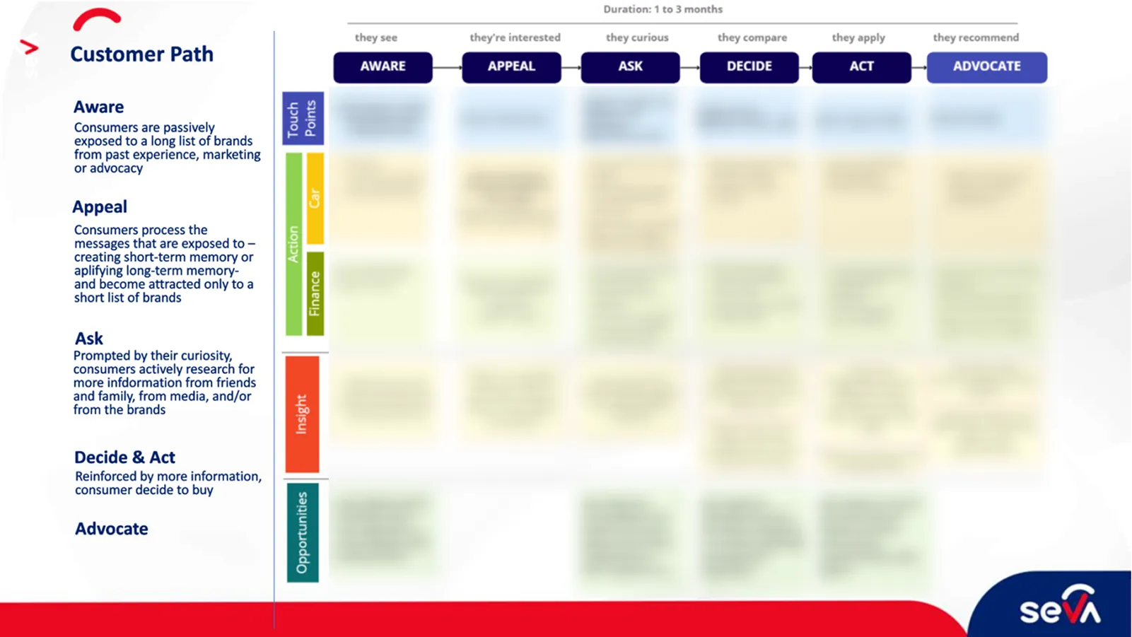
This structured yet nonlinear journey helped us contextualize user behavior, reinforcing the need for a seamless experience that supports decision-making at every step.
Several car marketplaces and e-commerce platforms surface past activity to help users resume browsing.
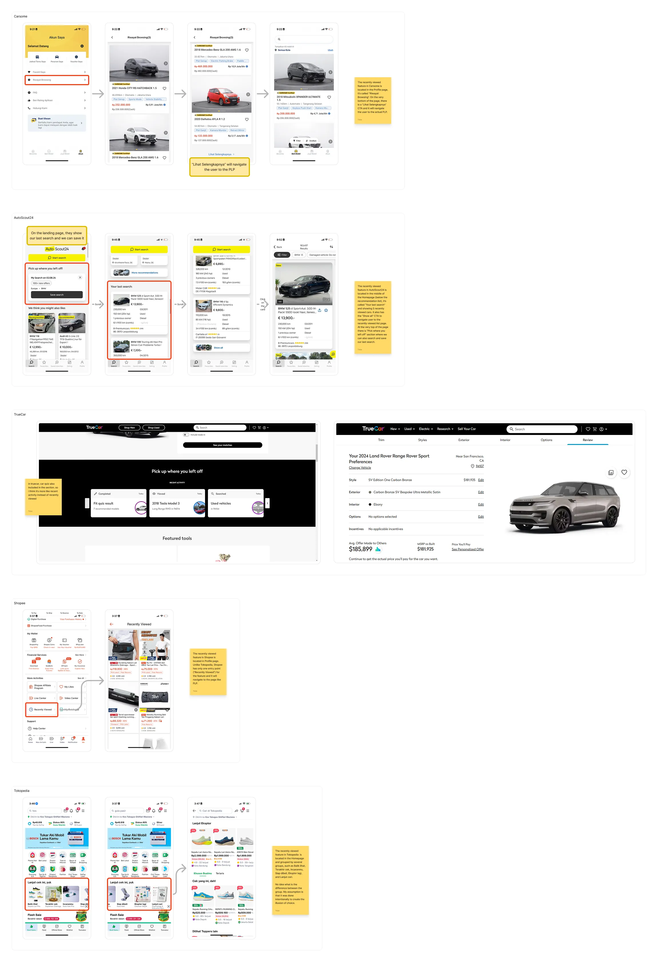
Showing recently viewed items or past actions helps users quickly reconnect with what they were exploring.
Many users explore financing but leave before continuing the process. A meaningful portion returns later, suggesting that their journey often spans multiple visits rather than a single session.
When users returned, the platform didn’t show their previous activity. Cars viewed, calculations run, or credit checks started were not visible, making it harder to continue where they left off.
If users could easily revisit their previous activity, continuing their exploration would require less effort. Instead of restarting the process, they could simply pick up where they left off.
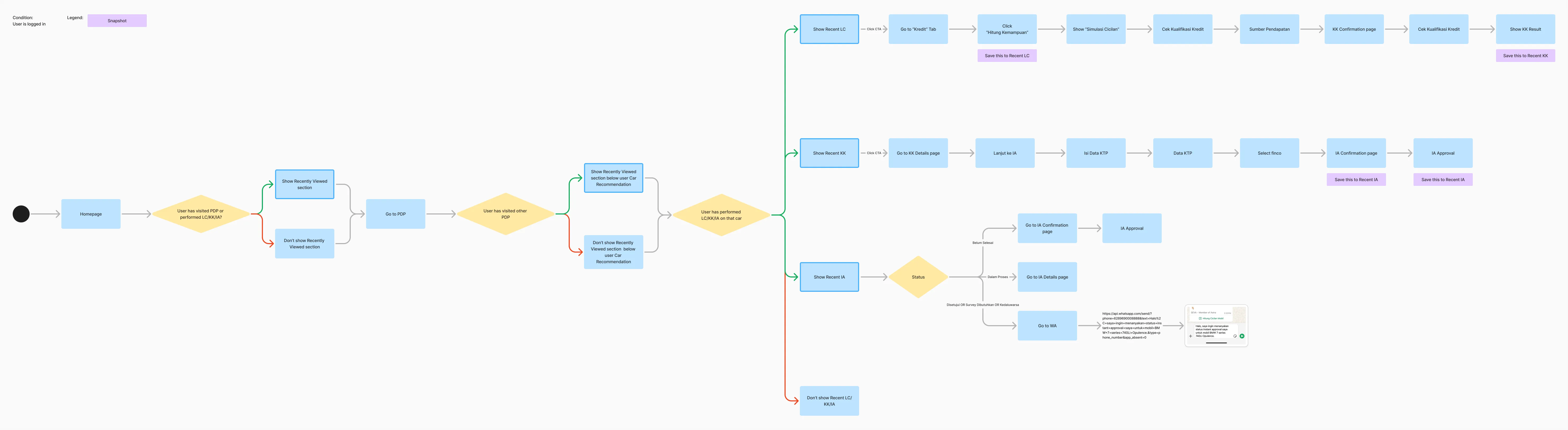
Before designing the interface, I mapped the financing journey to identify two moments: when the system should remember user activity and when it should surface it again. This helped determine where recent activity should be saved and where reminders would be most useful.
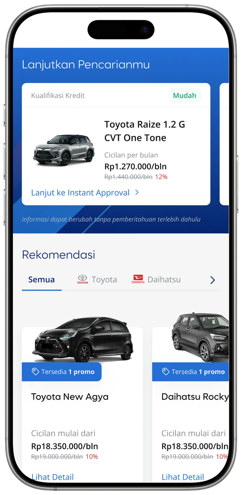
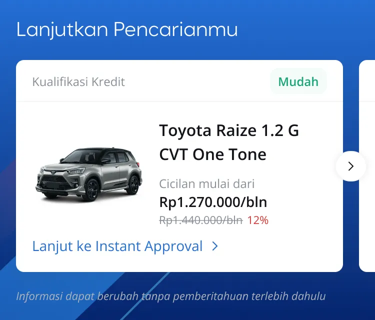
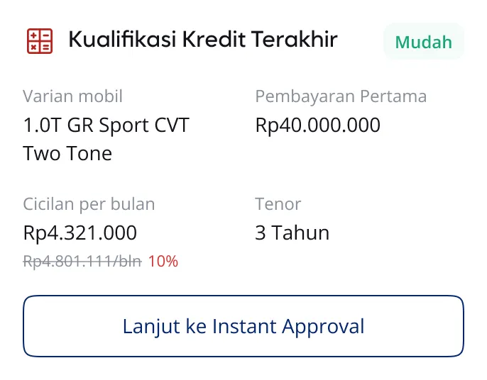
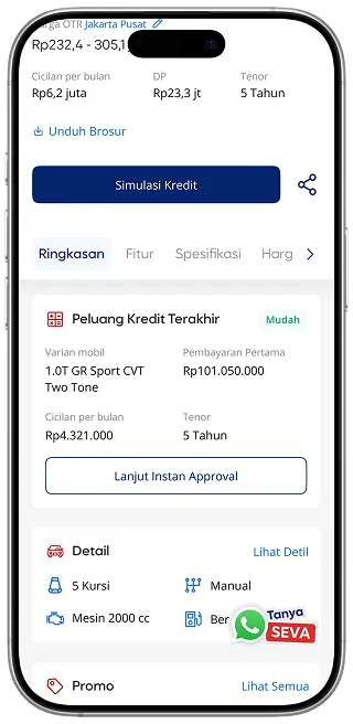
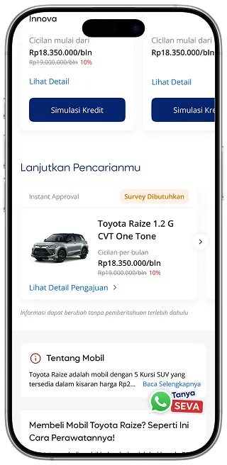
Recent Activity surfaces what users previously explored on the platform.


It helps users quickly revisit viewed cars, loan calculations, or credit checks, allowing them to continue their financing journey without starting over.
Blue background
So users can easily spot it
Status
Highlight Credit Qualification or Instant Approval status with a badge for better visibility
CTA
For clearer card interactions
Note
Since car prices, monthly installments, and discounts can change anytime, we added a small note to keep users informed
Status
Highlight Credit Qualification or Instant Approval status with a badge for better visibility
Title
Dynamic title based on last activity
Content
Dynamic content based on last activity
CTA
For clearer card interactions
Placement follows natural browsing patterns. On the
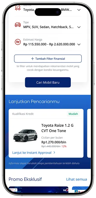
On the
one at the
The feature helps users reconnect with their previous activity when they return to the platform. Instead of restarting their exploration, they can quickly revisit what they were considering.
LIVE
If you want to experience this feature yourself, visit seva.id and give it a try!